
Last month Transport for London (TfL) issued a press release marking the launch of “the world’s biggest cycling infrastructure database” (the CID). It’s a significant undertaking in data collection, with every street in the city surveyed to record facilities of use to cyclists – from the odd parking rack all the way up to dedicated cycle lanes – and corral this information into a single, publicly-accessible location on the TfL website.
For the very keen, a full description of what was collected can be found here: https://cycling.data.tfl.gov.uk/CyclingInfrastructure/documentation/asset_information_guide.pdf
It not only supports TfL’s stated goal of having more Londoners get around by bike, it also continues their policy of openly offering their data for use by app developers, transport planners, and anyone of like-mind.
In my eyes, these outcomes are a step (pedal?) in the right direction. And, as TfL themselves point out, we’re only at the start of this particular journey. More tangible benefits from the CID are expected to follow in due course.
We at T-Kartor played an advisory role in the early stages of the project, and have been keenly awaiting news of its progress. Now that the CID has been unwrapped, I’ve compiled a short list of things I feel TfL could consider if the database is to have the significant, positive impact on cycling in the capital that the effort deserves.
Not in the sense of taking out costly ad space or plugging away on social media, but TfL could demonstrate a confidence in the strength of their data by ensuring that their own online journey planner doesn’t undermine cycling journeys in the way it orders results.
For example, at present, if you plan a journey from Leytonstone to Forest Gate the most prominent result will route you via the Central line with a change at Stratford for a TfL Rail service. That’s a 14 minute journey, costing £1.50 off-peak. Alternatively, a ‘moderate’ cycle between these points would only last 12 minutes, and cost you nothing. That result is shown much further down the page. Wouldn’t it be better (if not braver) to default to showing the quickest journey no matter the mode of transport?
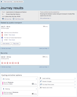
It is true that TfL’s journey planner has a ‘Cycling’ tab, accessed via a secondary menu, but segregating out cycle journeys from those made by public transport doesn’t allow for easy comparison, and therefore is unlikely to do much to encourage someone to get on their bike if they haven’t already made the decision to do so.
The CID is meant to go some way towards mitigating the loss of TfL’s printed cycle guides. The latter were costly to produce and distribute, and offered for free to anyone who requested a copy.
However, their demise means that getting an overview of London’s network of ‘Cycleways’ is rendered extremely difficult. The only current option is to use the Cycle map on TfL’s website, but it’s far from a satisfactory affair. You have to zoom right out to be able to see how (or if) each Cycle Superhighway or Quietway links with another, or to get a sense of their relation to identifiable quarters of the capital, but doing this causes the text labels for each cycle route (and those for station names, if you’ve turned those on) to merge illegibly on top of each other.
When zoomed in closer, other map discrepancies are also distracting. Cycle routes along two-way streets are often represented just by a single line down the middle of the road, save for some odd looking oval shapes at certain junctions. Gaps also exist where the line drawn on the map is perhaps too-faithfully recreating the data. This would be easier to make sense of if the routes shown offered any detail about the conditions the cyclist will face, but regretfully that is not yet a feature.
One wonders whether a more customisable basemap than that offered by Google would permit TfL to better visualise their cycle network. Clarity and accuracy could be increased, and in doing so the map would communicate the journeys possible more effectively. This particular point relates to a common quandary in cartographic technique – exactly how far do you go in generalising the appearance of a map feature (for example, ‘smooth out’ kinks in lines or simplify overly intricate sections) when balancing ‘truth’ with ‘ease of understanding’? The CID’s data could be used to derive a more stylised map product, graphically optimising the route lines at several useful scales.
Data is useful if it is accurate and current. This goes without saying for any data destined to help plan journeys in a city as complex and fast moving as London. Compiling the CID the first time round would have been a resource-intensive task, and at least some of that resource needs to now remain on-hand to keep the database as up-to-date as possible.
If that isn’t to be the case, then maybe TfL can encourage input from around the London borough councils whose roads and paths will be home to a good proportion of cycling infrastructure. Further down the line, even an OpenStreetMap-style open policy to crowd-sourcing edits and amends to the data could be pursued.
Whatever the route taken, it will be essential that TfL retain a ‘gatekeeper’ role, central to the process of verifying all the raw data as it is received.
Although TfL don’t appear to have made public their publishing schedule, tranches of the CID such as ‘cycle routes’ and ‘cycle parking’ do appear to be updated regularly. Indeed, as I write this both have data files no more than three days old.
Back at the end of the last decade, TfL set about building a mapping database with the aim to produce better guidance for pedestrians – the Legible London (LL) database. This was also created, in-part, by field checking the entire city. T-Kartor took part in the build, and we still maintain it on behalf of TfL to this day.
Those maps found at Cycle Hire docking stations in the capital are all derived from the LL database, their main purpose to guide someone who has just docked a bike and will walk the remaining couple of minutes to their destination and to find alternative docking stations. If the CID and LL databases are used together we would like to see cyclist-specific maps appearing at docking stations and roadside signs along the routes of London’s Cycleways.
This final point is really just to ask TfL to consider their current approach to how they use their own data. For a while now, TfL has taken an admirable lead in openly publishing and distributing data via their website and the CID continues this trend. Much of the press release is dedicated to drumming up enthusiasm among app developers and others who may be able to find innovative uses for the CID output.
I do wonder though whether the most efficient means of progressing towards TfL’s ‘active travel’ goals lies in leaving it up to third parties to decide what this data can be used for, how it should be presented, and to whom it will be targeted. There is still tremendous value and trust in the roundel, and a TfL-authored app would enter the market with a noticeable splash.
It is still early days for the CID, and we hope the near future will bare some fruit for all the labour that has gone on behind the scenes up to this point. Hopefully then cyclists both new and old will feel the benefit.