
Regardless of the mode of travel, by rail, bus, boat, cycle or on foot, the purpose of any good transport map should be to make the network legible. Allow users of the system to understand, visualise, retain, and then confidently navigate around the transport network. Entry points, exit points, all the myriad of connections and possibilities. Present all viable transport options, with or without bias. There are certainly justifications for doing the former, and offer a hierarchy of possible routes; be they based on speed, frequency, accessibility, or any number of alternative criteria.
A few weeks ago, renowned transport planner and author Jarrett Walker put forward the argument that maps focused on transport still have a critical role to play. Jarrett ends his post with a succinct but powerful statement: “if a system map doesn’t exist, people can’t understand all that your transit system can do”. Call me one of the converted, but I couldn’t agree more.
Then, slightly more recently, French state railway operator SNCF relaunched (and rebranded) their consumer website, which in today’s age is the main channel of communication with the users of their transport system. With Jarrett’s post still in my thoughts, I was struck by how SNCF have seemingly taken the complete opposite approach. Not only are their train services not presented through any kind of map or diagram (not at all uncommon, unfortunately), but they seem to have put all their faith in a single paradigm : search.
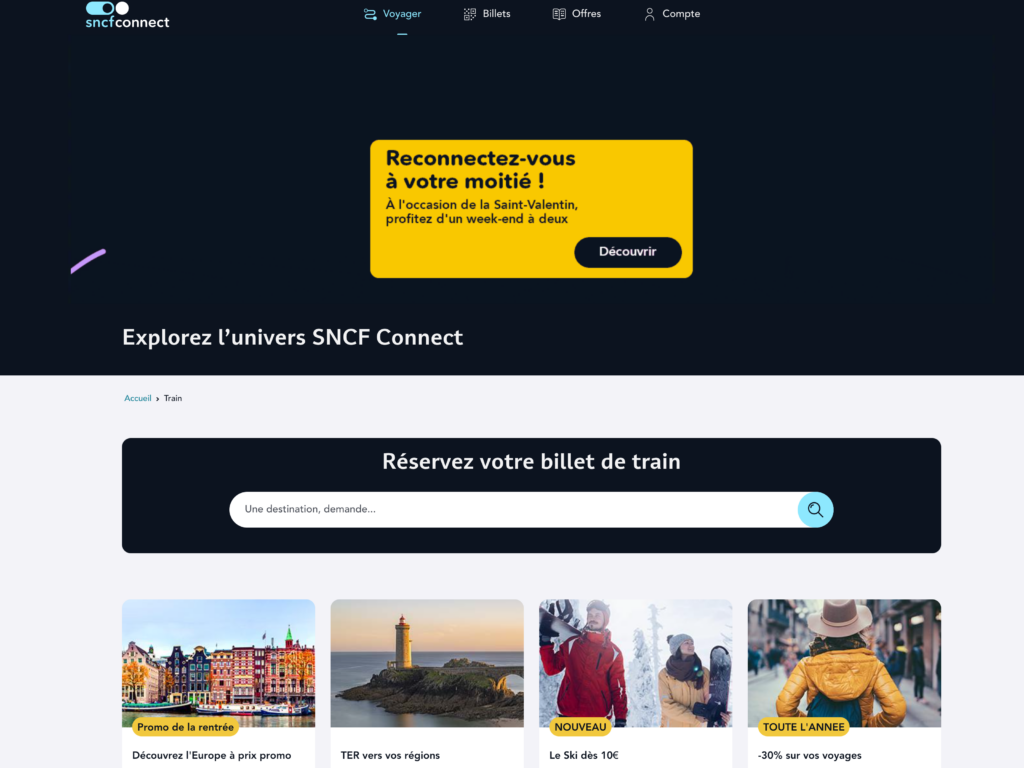
sncf-connect.com, where visitors are asked to search for the network (or be diverted by advertisements)
So if you are unfamiliar with every corner of SNCF’s network of routes – and given the national scale of their network, that’s 99.9% of their users – your only means of getting a handle on what the transport system has to offer, is to first think of a destination, and then hope for the best. The results that are returned (eventually, after having had to refine your query using to a more typical journey planner), come in the form of a chronological listing of possible journeys, and their cost. Again, this not unusual for a transport operator who wishes to promote longer distance, more profitable, city-to-city journeys. But it completely obscures any sense of possibility, and in the case of SNCF doesn’t even allow you to filter results by direct or indirect routes, total journey time, or cost.
More critically, as is true of any transport network described only via the results of a journey planner, it suppresses any likelihood that someone would explore connections, options, possibilities, and start to form a mental map of their own. Nobody walks away from these experiences with the feeling that they are now confident navigators. And if ever something goes wrong, and the journey planner is not available, there is little chance of being able to manually re-plan a route or even retrace your steps.
Perhaps slightly bizarrely, SNCF (via their infrastructure arm, SNCF Réseau) do publish maps of their network, but they are only concerned with planned closures for maintenance and upgrades of particular lines. And the one (excellent) all-network map available displays lines but not services, so is not much help for planning journeys.
It doesn’t have to be this way. Just as the concept of ‘legibility’ is now well understood by the designers of pedestrian wayfinding systems, it should also be the goal of mappers of transport systems – make it legible. Don’t hide away the intricacies of your transport network by only ever presenting journeys in table form. To enable people to create connections in their mind’s eye, and translate those to real world connections between transport nodes, you should present this information visually. And that really should be in the form of a map. Geographic, diagrammatic, whichever form makes most sense for the scale of the journey being undertaken.
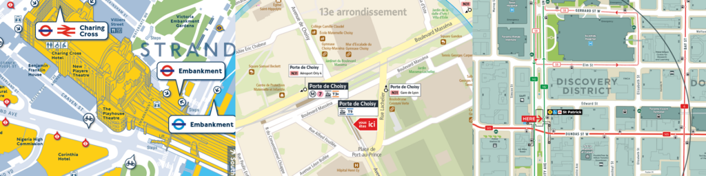
Making the network legible: transport options, and the links between them, presented clearly. Three examples by T-Kartor: i) WalkVM Trafalgar Square, © Transport for London, ii) Plan de proximité Porte de Choisy, © Île-de-France Mobilités, iii) Local area map St. Patrick, © Toronto Transit Commission
I’ll conclude with the mantra of Jug Cerović, architect and transport map designer extraordinaire, who states simply that “the map is the network”. The map gives the otherwise abstract network a recognisable form, comprehensibility, and usability. A list of routes chronologically sorted in a table does not.
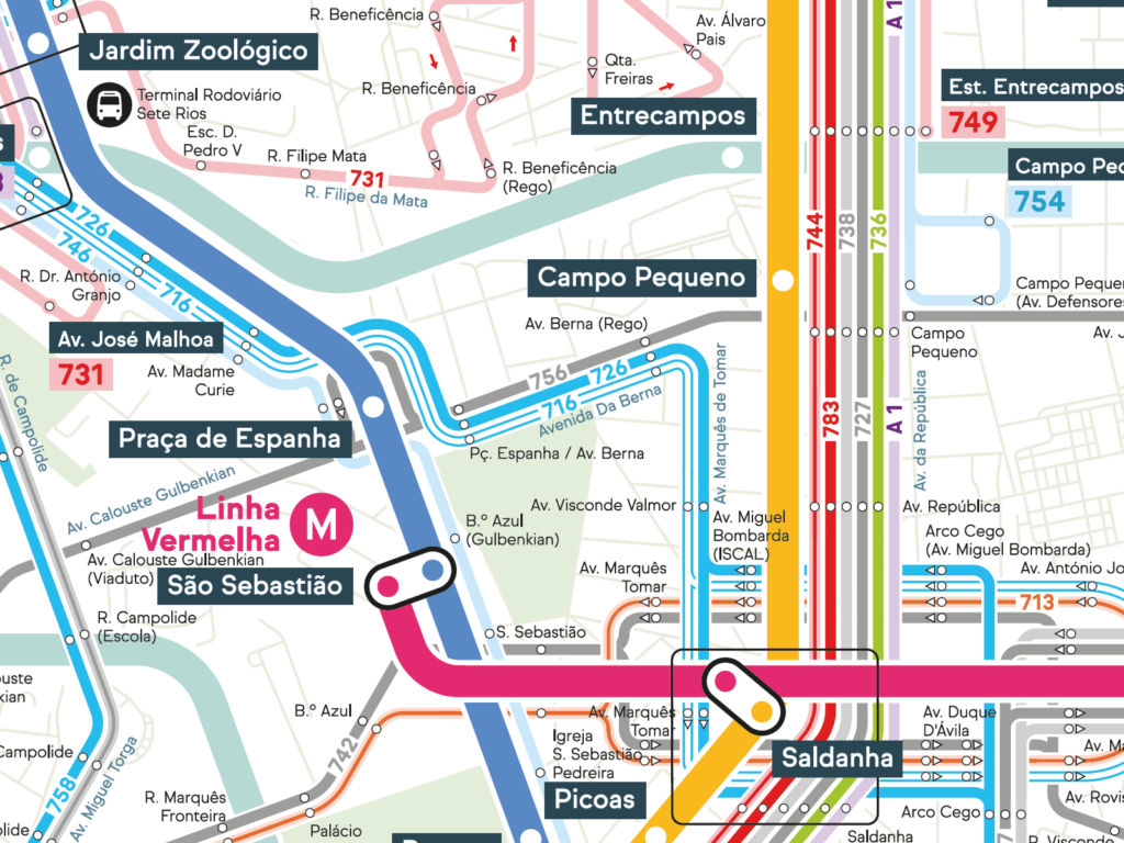
The map is the network. Lisboa Mapa Rede Integrada, © Jug Cerović, inat.fr
In the posts that follow, I’ll expand upon this main theme and consider specific strategies that map designers (and the transport agencies that employ their services) can follow in successfully communicating a legible network.