
At the time of Legible London’s inception in 2010, Slate magazine highly commended the new signage but doubted it could be realised: “comprehensive systems are more commonly found in smaller cities”, and of the goal of a city-wide roll-out for the London 2012 Olympic Games: “with budget shortages and a time crunch … extremely tough to meet”.
This post will examine how T-Kartor managed to roll out the Legible London basemap cost-effectively for the whole of Greater London in time for the Olympics and created over 10,000 map based wayfinding products during the system’s first ten years.
By the end of 2009 Legible London pilots consisting of 60-80 signs had been created for the South Bank and Bankside, Covent Garden; Bloomsbury Clear Zone and Richmond & Twickenham and were undergoing evaluation. The signs proved very popular with the public and it was decided to continue the roll-out of Legible London wayfinding.
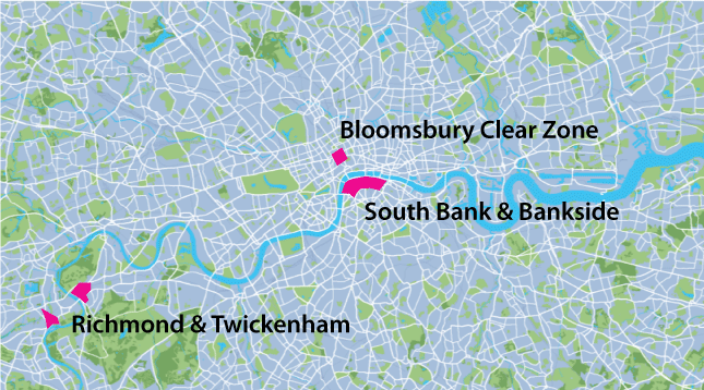
Illustration 1: the three original pilot areas for Legible London
The goal was to cover the Cycle Hire area: 400 docking stations spread over an area of 66 km2, for its planned launch in June 2010. Two years later, the complete wayfinding system would need to cover the whole of Greater London, an area of 1,600 km2, for the London 2012 Olympics.
Budget calculations based on the original pilot methodology and an area the size of the Congestion Charge Zone (below) were seen as extremely prohibitive, without even considering that the whole of Greater London would cover 72 times this area.
T-Kartor were able to offer cost-efficient development methods combined with a mix of economies of scale, design pragmatism and lessons learned from the pilot to bring costs within a reasonable level. In fact the city wide basemap was created for less than a third of the original quote for the Congestion Charging Zone.
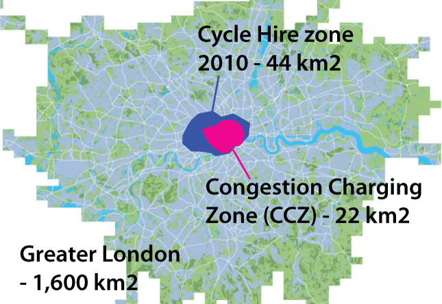
Illustration 2: The Congestion Charge Zone (22 km2), Cycle Hire (66 km2) area and Greater London (1,600 km2)
The problem was solved by creating a seamless GIS database instead of individual map files. This had the advantages that we were able to start with data which already existed, editing rather than creating it from scratch. In addition a system could be offered with the ability to create any map, rotated, overlapping, varying in size and format, virtually “on-the-fly” and highly automated.
In its data form, a GIS database consists of separate sources of lines, shapes and points, with geographic coordinates placing them in their correct position. This data has no colour, font, text size or scale. A map, or cartographic product, is created by selecting the data, colouring it according to a design specification, and ordering it in layers so that a realistic, legible interpretation is created.
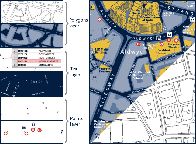
Illustration 3: GIS data has no styles applied, no fonts and no scale. The application of these graphic styles creates a map product
The use of existing data meant that rather than manually drawing map objects and typing road and object names (both very labour intensive), the work involved selecting and validating existing objects, then enhancing their graphic appearance (using generalisation and batched graphic tidying) as styles are added at the appropriate scale. In this way, large areas can be processed at the same time, layer by layer.
It should be noted that no dataset is suitable for use without a large amount of work, as each dataset is created for purposes other than pedestrian wayfinding. City owned cadastral mapping, for example, is created as a record of the extent, value and ownership of land. It includes highly accurate building shapes (useful for our building layers) and details of land use, but may be less complete for depicting footpaths through public parks. For wayfinding purposes accuracy in footpaths is more important than exact building edges, and this is one of the layers which requires extra attention, in the form of complementary data, reference material, and graphic enhancement.
Besides graphic legibility in land use, footpaths and other topographic features, a pedestrian wayfinding basemap needs to be selective with how much information it portrays. A hierarchy of information was developed to allow landmark buildings to stand out and large area names to be visible but not distracting.
City municipal GIS datasets include a lot of information superfluous for wayfinding. A considerable effort is required to manage content, layer by layer, including carrying out field surveys to check accuracy. This step is essential to guarantee the accuracy of the highest priority layers, such as landmark buildings (names, entrances and positions) and public transport infrastructure.
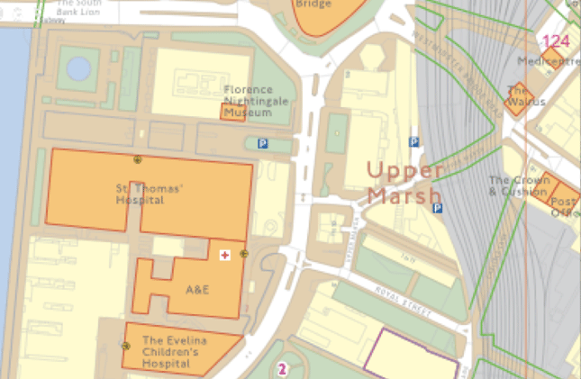
Illustration 4: This field survey plot shows all available data, with useful data for validation highlighted for clarity in the field
The final Legible London cartographic database is a legible, accurate, consistent, basemap which is constantly maintained to reflect constant changes in the city. It is served from T-Kartor’s mapping platform which enables automated, cost-effective outputs of thousands of rotated, overlapping map products. Each map output comes from current data and follows TfL’s rigorous content and design guidelines.
Illustration 5: This film shows the complexity of the complete database, being drawn “on-the-fly” by the system software